Portfolio project · Cosmetic packaging
KEULLIN: structural cosmetic packaging with quiet, tactile confidence.
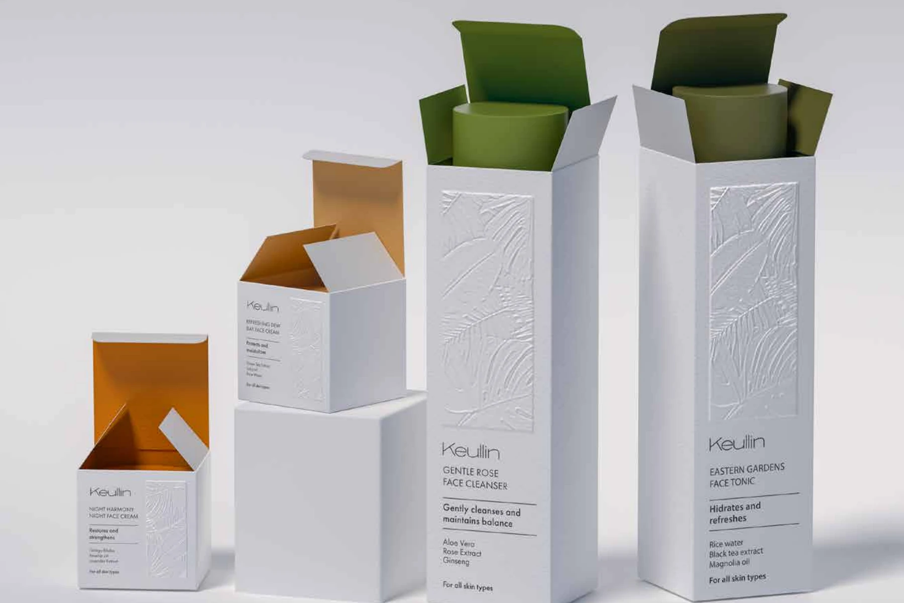
A carton and product range developed from audience and positioning research, combining disciplined typography, contrasting interiors and embossed botanical detail.
01 · The challenge
Make a gentle proposition visible without falling into generic beauty codes.
The project began with target-audience and positioning research. The goal was to communicate care, balance and natural ingredients while retaining enough character to stand apart in a visually saturated category.
02 · Visual strategy
A visual metaphor becomes a scalable range architecture.
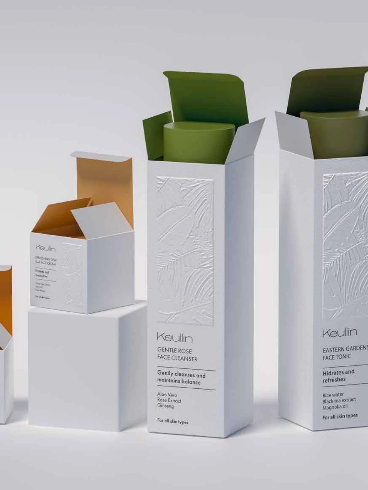
Composition, colour and typography were organized so every product could be read quickly while remaining part of one recognizable family. Green and amber interiors add differentiation and create a controlled moment of discovery when the carton opens.
03 · Packaging system
Restrained from a distance, expressive in the details.
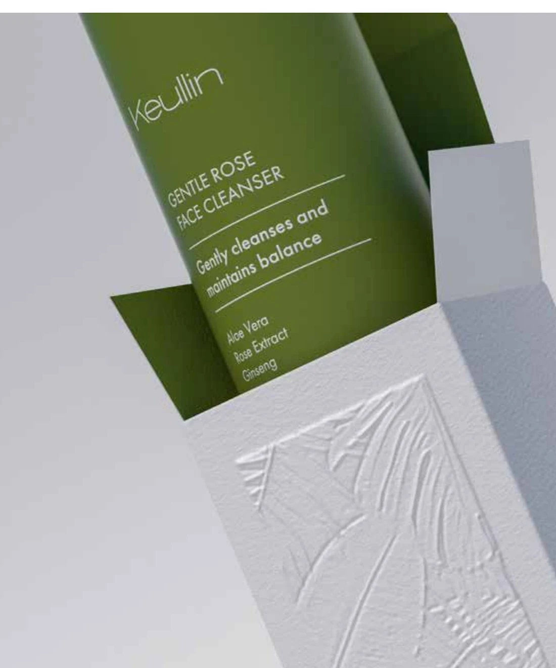
The white exterior uses precise typography and embossed botanical forms. Interior colour supports range navigation without competing with product information. The system can adapt to different sizes and pack formats while retaining the same visual logic.
04 · Production and 3D
The design is not finished until the file can be made.
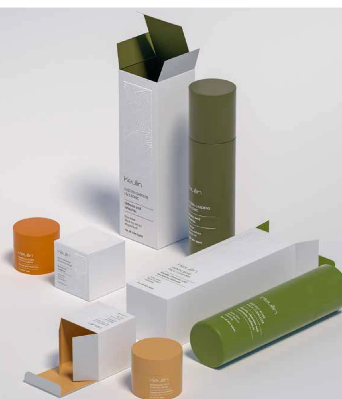
Packaging work in the supplied portfolio was prepared for print and accompanied by recommendations on materials and post-press finishes. Cinema 4D supported form, scale and pack interaction studies and created presentation imagery before manufacture.
- Front, side and back hierarchy
- Format and variant architecture
- Print-ready artwork preparation
- Material and finishing recommendations
- 3D visualization for presentation