Portfolio project · Café branding
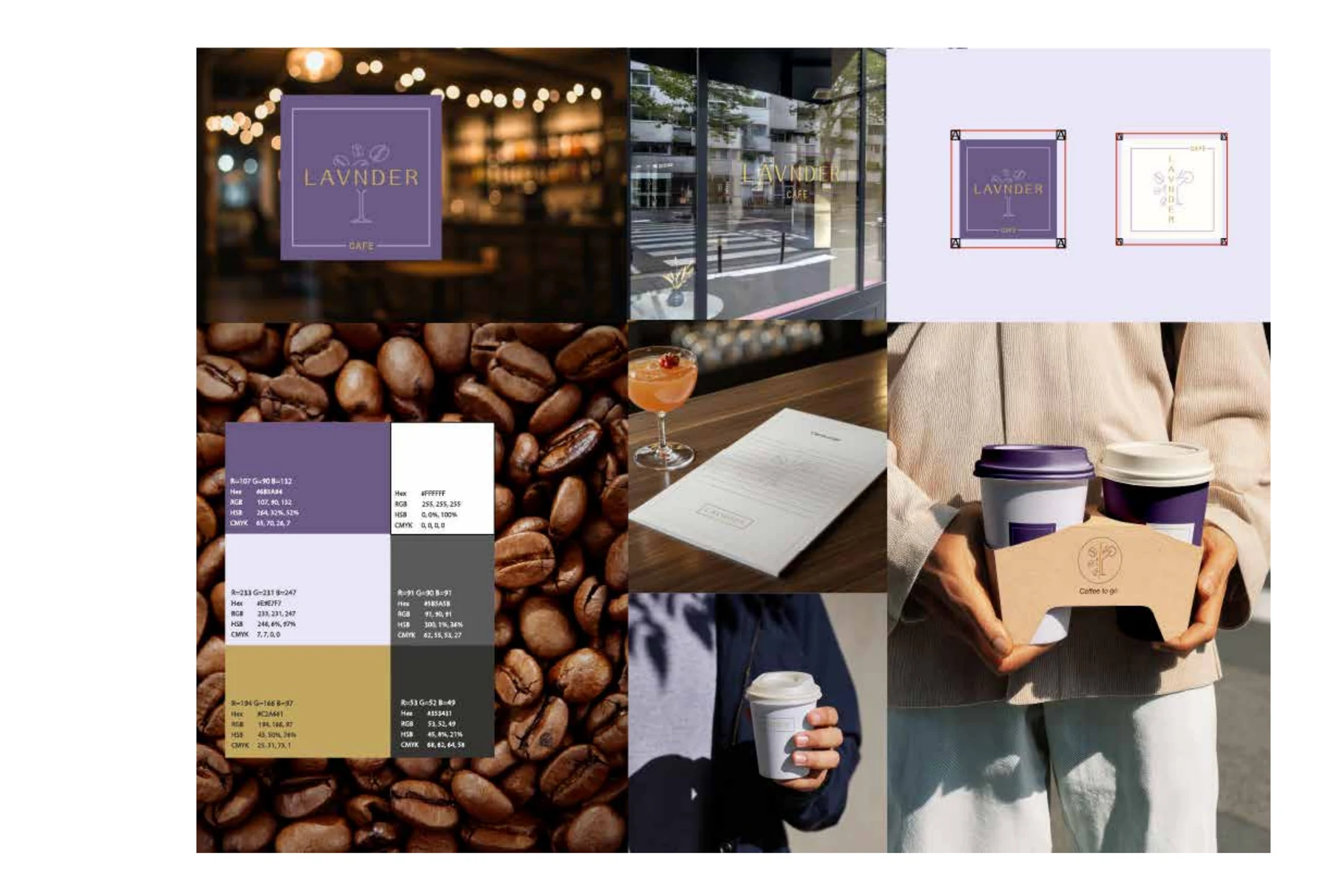
LAVNDER Café: a calm identity with one memorable accent.
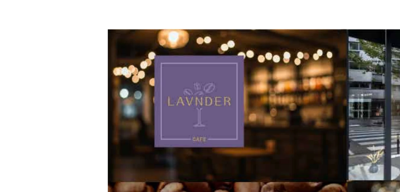
A violet, cream, graphite and gold system applied across signage, menu, storefront and takeaway packaging.
01 · Idea
A café should be recognizable before the first sip.
The system combines a calm base with a distinctive violet and restrained gold accent. The direction avoids generic artisanal coffee styling and creates a more contemporary, considered presence.
02 · Identity
Colour, symbol and type behave as one family.
The identity is built to work on a storefront sign and on the smallest takeaway cup. Colour and composition preserve personality even when the main logo is not the dominant element.
03 · Experience
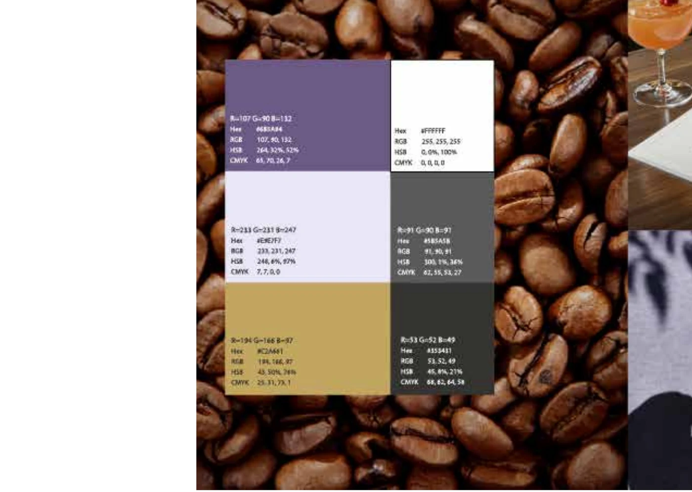
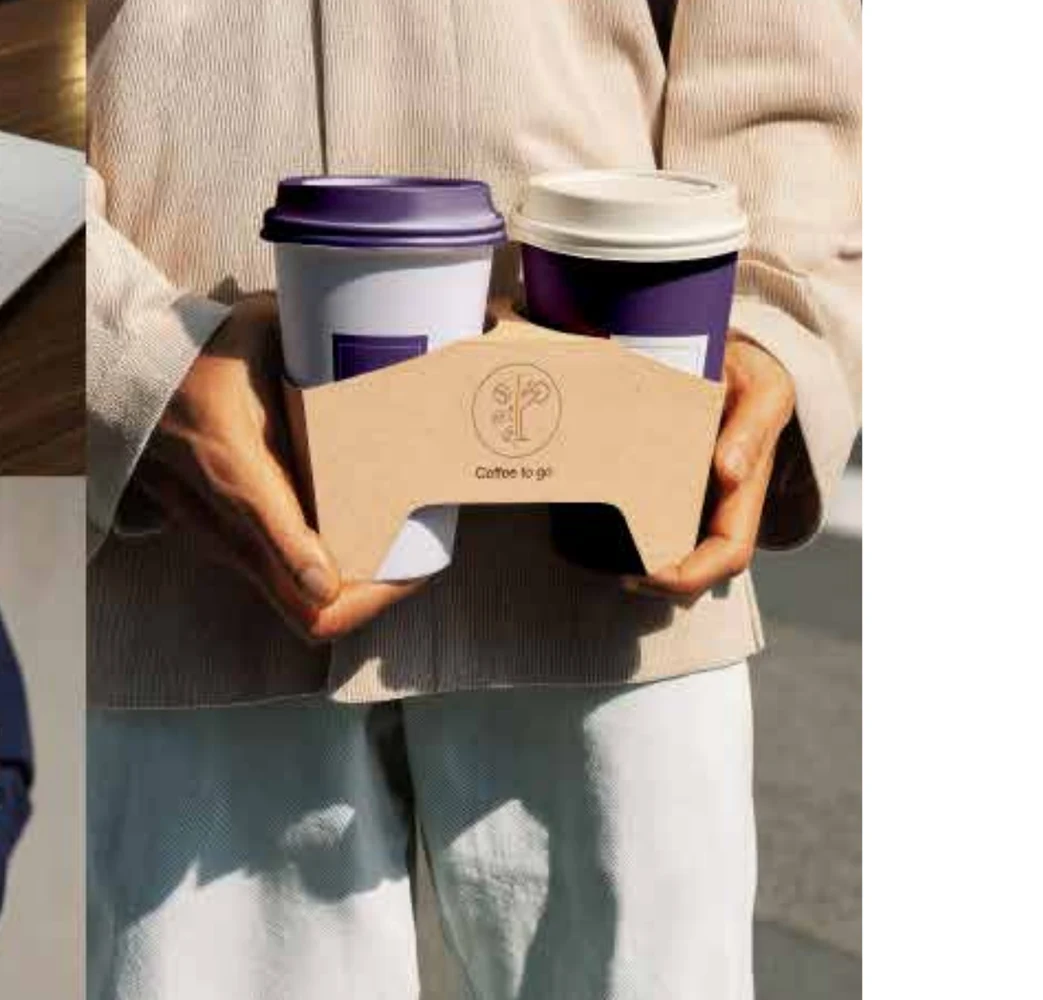
The brand continues in the customer’s hand.
Menus, cups and carriers turn takeaway into an extension of the space. Consistency between signage, printed material and packaging makes recognition less dependent on any single asset.
04 · Expandable scope
A system ready to grow with the venue.
- Primary identity and compact marks
- Storefront and interior signage
- Menu and printed materials
- Cups, carriers and takeaway packaging
- Opening communication templates