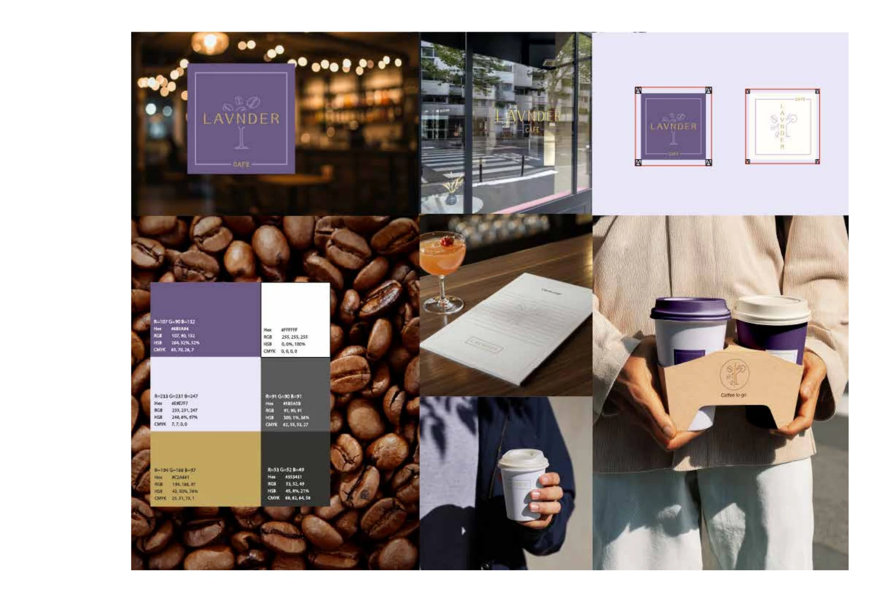
Typography, colour, material and imagery express the product promise before use.
Brand Identity Design
Brand identity
designed
as a system -
not just a logo
Build a recognizable visual language that works across packaging, websites, campaigns and every future product extension.

Architecture keeps categories, strengths, routines and sizes connected.
Small typographic and production decisions support perceived quality.
Overview
A strong identity is not a decorative layer added after the important decisions. It is the visible expression of what the brand stands for, who it is for and why it deserves attention. The project begins by clarifying the commercial context, audience, category codes and desired position before any logo route is developed.
The result is a connected visual system: logo configurations, typography, colour, composition, imagery direction and graphic devices designed to work together. Packaging is considered from the start when it is central to the business, so the identity does not collapse when applied to a small label, a crowded back panel or a growing product family.
Problems this
service solves
- The current logo exists, but the wider brand has no recognizable visual language.
- Every supplier or team member interprets the brand differently.
- Packaging, website and social content feel like separate businesses.
- The identity cannot stretch to new categories, markets or product tiers.
- A launch needs to look credible before the brand has a long history.
What is included
- Discovery questionnaire and working session
- Competitive and visual-context review
- Positioning and creative-direction summary
- Primary logo, secondary marks and responsive configurations
- Typography and colour system
- Graphic language, composition and image direction
- Core packaging or digital applications
- Practical brand guidelines and organized master files
How the work
is developed
The first creative presentation explores a small number of strategically distinct directions rather than dozens of superficial logos. Each route is shown in realistic applications so decisions are based on how the identity behaves, not on an isolated symbol.
Once a direction is selected, the system is refined across high-priority touchpoints. Edge cases - small sizes, multilingual layouts, one-colour production and product extensions - are considered before handover.
Production,
approval
and handover
Master artwork is prepared in appropriate professional formats, with naming and folder structure designed for future use. The guideline documents what is fixed, what is flexible and how to maintain consistency without making the brand rigid.
Trademark searches and legal clearance are not included unless arranged with a qualified specialist. The client remains responsible for final name, claim and trademark approval.
Frequently
asked questions
Is a logo included?→
Yes. The logo system is developed as one part of the broader identity, together with typography, colour, composition and practical applications.
Can the identity be created before packaging?→
Yes. The identity can be developed first, while packaging requirements are considered early if packaging will be a central commercial touchpoint.
Will I receive editable files?→
Yes. Final approved master files are organized in appropriate professional formats together with practical usage guidance.
Experience
Related portfolio
evidence
Work from the supplied portfolio shows how this approach is applied in practice.